Chapter 4. Objects and the Toolbox
Table of Contents
A diagram in Dia consists of a set of objects. Objects are shapes that are either predefined or user-defined. The Toolbox allows you to select the desired object and allows you to set default properties for objects.
4.1. Dia Toolbox Overview
Figure 4.1. Dia Toolbox
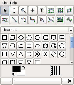
When Dia is executed, two windows open: the canvas, which contains the diagram, and the Toolbox, which contains the object palettes and other controls. The Toolbox is divided into three regions. The top region contains 14 buttons. The first three are controls used to adjust the diagram. The next 11 are the icons for the built-in basic objects.
The middle portion of the Toolbox contains the selected Special Objects. This is used to select among the many built-in object sheets supplied with Dia, such as UML, Flowchart, Network, etc.
The bottom portion of the Toolbox contains special controls that set default properties for objects placed on the canvas. These include foreground color, background color, and line width. There are also three controls that set the default properties for line objects. These are beginning arrow style, ending arrow style, and line style.
4.1.1. Modify Control
Figure 4.2. Modify Control

The Modify control is the default setting when using Dia. This control allows you to select one or more objects on the canvas. After an object is added to the diagram, the Modify control is automatically selected for you. This makes it easy to add an object and then continue working without having to reselect the Modify control.
![[Tip]](images/tip.png) | |
You can toggle between an object control and the Modify control using the Space key. For example, say you wish to add several Box objects to the diagram. First, click on the Box icon and click on the canvas to add the Box. At this point, the Modify control will be selected automatically. To reselect the Box control, press the Space key. Now you can click on the canvas again to add a second Box object. Continue to press Space and then click to add as many Box objects as desired. |
| |
You can customize Dia to disable the automatic selection of the Modify control. See Customization / User Interface for more information. |
4.1.2. Textedit Control
Figure 4.3. Textedit Control

The Textedit control is new with Dia from version 0.97 - it indicates being in text edit mode. Together with an appropriate object selection it is one way to start text modification.
An object supporting in-canvas text editing can be in two different selection modes. The normal selection is the same for all objects, it allows to manipulate the objects position, grouping etc.. Some object can enter a second selection mode, which allows to edit their text from the canvas.
| |
There are multiple ways to enter text edit mode. You can press-and-hold the left mouse button, activate text editing by Enter or F2 key or select the respective object after activating Textedit from the toolbox. |
4.1.3. Magnify Control
Figure 4.4. Magnify Control

The Magnify control is one method for zooming in or out. See The Canvas / Zooming for more information about zooming. The Magnify control stays active until you press one of the other controls.
4.1.4. Scroll Control
Figure 4.5. Scroll Control

The Scroll control is used to move around the diagram. When this control is active, the mouse pointer changes to a hand. When the Scroll control is active, you can scroll around the diagram by clicking anywhere on the canvas and dragging the mouse. The diagram scrolls within the canvas window. The Scroll control stays active until you press one of the other controls.
4.1.5. Basic Objects
After the Modify, Zoom, and Scroll controls, the next 11 buttons allow you to place Dia's basic objects on the canvas. See Basic Objects Introduction for more information on Dia's basic objects.
4.1.6. Special Objects
Figure 4.6. Special Objects
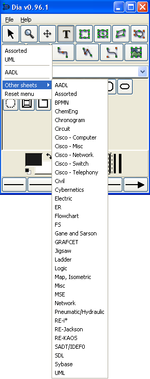
On the Toolbox, just below the basic object icons, is a drop-down listbox that allows you to select a sheet of special objects to be included in the diagram. As you can see from the screenshot above, Dia provides a large number of special objects. To use a special object, first select the desired sheet using this drop-down listbox. Then, just click on the desired object and click on the canvas to insert the object. See Special Object Categories for more information on the various types of special objects available.
4.1.7. Default Color, Line Width, and Line Style
Figure 4.7. Default Color, Line Width, and Line Style
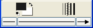
Below the special objects palette are controls for setting the default foreground and background color, line width, and line style. These controls all set default properties for new objects being added to the canvas. They do not affect the properties of existing objects already on the palette. These settings stay in effect for all future Dia sessions, until they are changed.
The two squares on the left allow you to set the default foreground and background colors for all new objects being added to the diagram. If you double-click on the upper square (i.e., the black one in the screenshot above), you can set the default foreground color for all new objects. Double-clicking on the lower square (white in the screenshot) allows you to select the default background color. See Objects / Colors for more information about selecting colors.
| |
Figure 4.8. Restore Default Colors Button  To set the colors back to the default, click on the black and white box to the bottom left of the color selector. |
| |
Figure 4.9. Reverse Colors Button  To inverse the colors, click on the little arrow to the top right of the two boxes. |
Figure 4.10. Default Line Width

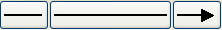
To the right of the two squares are five lines of increasing width. To select the desired default line width, simply click on it. A dashed-rectangle indicates which width is currently selected.
Figure 4.11. Arrow and Line Style
At the bottom of the Toolbox are three buttons. The left button allows you to select the default arrow shape for the beginning of a line. In the screenshot this is defaulting to "no arrow". The right button allows you to select the default arrow shape for the end of a line. Since only lines have arrows, these buttons only affect line objects and have no effect on other shapes. The middle button allows you to select the default line style (solid, dashed, etc.).
![[Note]](images/note.png) | |
The line-width and line style settings affect all basic objects. For shapes, these settings determine the line properties of the shape outlines. These settings also are used for some special objects (e.g., Flowchart objects). Other special objects (e.g., AADL objects) have fixed line widths and are not affected by these settings. |